Riptide Energy
Brand identity and packaging for a zero-sugar energy drink, built on Breakthrough, an original display typeface.
Brand Identity
Typefaces
Packaging
Food & Drink
Made with
Glyphs

About the project
Riptide began with a typeface. Breakthrough’s sharp breaks and forward lean already read as speed and force; the brand gives them a product to move.
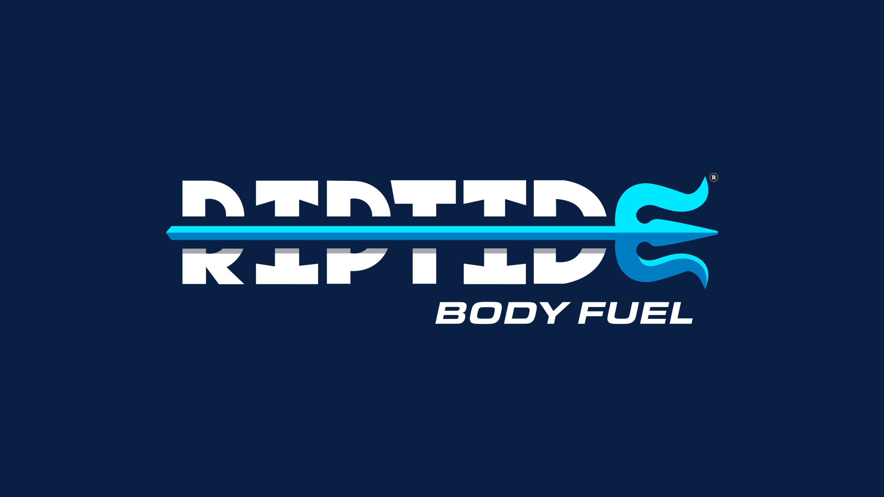


Classic, solid and knockout versions of the wordmark, and the trident on its own as the brand symbol.
The mark
One spear runs through the wordmark and ends in a trident: a symbol and a signature drawn in a single line.

Breakthrough, the original display typeface behind the brand. Deliberate breaks fragment every stroke while the pieces still read as one letter.
Typeface
Every letter in Breakthrough is deliberately broken, yet the fragments flow into one another, so the word stays legible at speed.
Electric Cyan
HEX #00E5FF
RGB 0 229 255
Deep Navy
HEX #0A1F44
RGB 10 31 68
Black
HEX #000000
RGB 0 0 0
White
HEX #FFFFFF
RGB 255 255 255
Orange Blast
HEX #F7491D
RGB 247 73 29
Lemonade Surge
HEX #F4D462
RGB 244 212 98
Blue Current
HEX #1C75BC
RGB 28 117 188
Core palette of deep navy and electric cyan, with one signal color per flavor.
Packaging
One navy can, three flavors. A single color carries each flavor and everything else holds steady, so the range reads as one brand from across the aisle.


Full production dielines for Orange Blast, Lemonade Surge and Blue Current: nutrition facts, ingredients, barcode and the tagline “Ride the Tide.”
Campaign
Each flavor gets a world of its own, from citrus still lifes to a can rising out of dark water, while the can itself never changes.


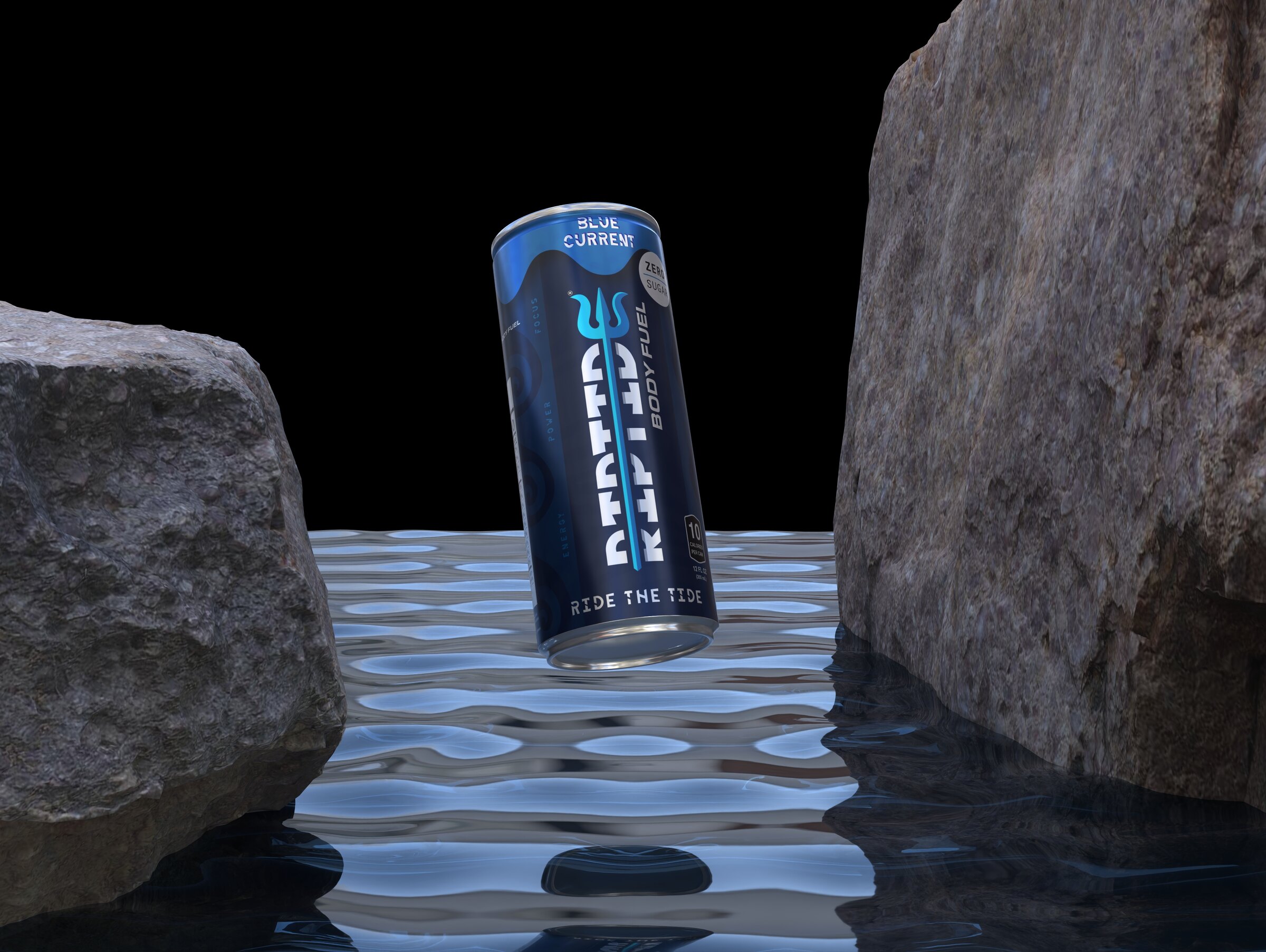


Product imagery for the launch range: Orange Blast, Lemonade Surge and Blue Current.
Project
Riptide Energy
Type
Concept brand & packaging
Sector
Food & Drink
Disciplines
Brand Identity
Typeface Design
Packaging
Year
2026
Context
Graphic Design Studio,
Adelphi University
Design & typeface
Benjamin Eppel
Riptide Energy is a concept energy drink brand built to put a custom typeface to work. Breakthrough, an original display face, leads every touchpoint, from the wordmark to a three-flavor can range, showing how type alone can carry a product’s personality and hold a brand system together.
The ask
The brief was to take an original typeface and prove it in the real world, in either an editorial or a product context. Breakthrough’s sharp angles, heavy weight and forward motion already suggested speed and intensity, so the answer was a product built on exactly those ideas: an energy drink, a category sold on performance, power and momentum.
Breakthrough
Breakthrough is built around interruption. Every letter carries deliberate breaks that fragment its strokes, yet the pieces flow into one another, so words hold together and stay legible. It is designed for large sizes, where the fractures read as motion, which makes it at home in sports, technology and gaming, and on a can competing for attention on a crowded shelf.
A spear through the name
The wordmark sets RIPTIDE in Breakthrough and drives a single spear through the letters, ending in a trident. The trident doubles as a standalone symbol, and the lockup carries a “Body Fuel” descriptor. Classic, solid navy, solid black and knockout versions keep the mark consistent on any background.
One can, three flavors
Deep navy and electric cyan form the core of the brand, with an ocean-inspired wave pattern running behind every can. Each flavor (Orange Blast, Lemonade Surge and Blue Current) is identified by a single color in a wave-edged band at the top of the can, so the range reads as one family while each flavor stays easy to find. The labels are built as full production dielines: a vertical wordmark running the height of the can, zero-sugar and 10-calorie callouts, gluten-free and kosher marks, nutrition facts, ingredients, barcode and the tagline “Ride the Tide.”
Type as identity
Riptide shows a typeface moving beyond lettering to become the core of a product’s identity. Breakthrough sets the tone, the trident gives it a symbol, and a disciplined color system lets the range grow flavor by flavor without losing its shape.
Menu
Riptide Energy
Brand identity and packaging for a zero-sugar energy drink, built on Breakthrough, an original display typeface.
Brand Identity
Typefaces
Packaging
Food & Drink
Made with
Glyphs
About the project
Riptide began with a typeface. Breakthrough’s sharp breaks and forward lean already read as speed and force; the brand gives them a product to move.
Classic, solid and knockout versions of the wordmark, and the trident as the brand symbol.
The mark
One spear runs through the wordmark and ends in a trident: a symbol and a signature drawn in a single line.
Breakthrough, the original display typeface behind the brand.
Typeface
Every letter in Breakthrough is deliberately broken, yet the fragments flow into one another, so the word stays legible at speed.
Electric Cyan
#00E5FF
Deep Navy
#0A1F44
Black
#000000
White
#FFFFFF
Orange Blast
#F7491D
Lemonade Surge
#F4D462
Blue Current
#1C75BC
Packaging
One navy can, three flavors. A single color carries each flavor and everything else holds steady, so the range reads as one brand from across the aisle.
Full production dielines for all three flavors.
Campaign
Each flavor gets a world of its own, from citrus still lifes to a can rising out of dark water, while the can itself never changes.
Product imagery for the launch range.
Type
Concept brand & packaging
Sector
Food & Drink
Disciplines
Brand Identity, Typeface Design, Packaging
Year
2026
Context
Graphic Design Studio, Adelphi University
Riptide Energy is a concept energy drink brand built to put a custom typeface to work. Breakthrough, an original display face, leads every touchpoint, from the wordmark to a three-flavor can range, showing how type alone can carry a product’s personality and hold a brand system together.
The ask
The brief was to take an original typeface and prove it in the real world, in either an editorial or a product context. Breakthrough’s sharp angles, heavy weight and forward motion already suggested speed and intensity, so the answer was a product built on exactly those ideas: an energy drink, a category sold on performance, power and momentum.
Breakthrough
Breakthrough is built around interruption. Every letter carries deliberate breaks that fragment its strokes, yet the pieces flow into one another, so words hold together and stay legible. It is designed for large sizes, where the fractures read as motion, which makes it at home in sports, technology and gaming, and on a can competing for attention on a crowded shelf.
A spear through the name
The wordmark sets RIPTIDE in Breakthrough and drives a single spear through the letters, ending in a trident. The trident doubles as a standalone symbol, and the lockup carries a “Body Fuel” descriptor. Classic, solid navy, solid black and knockout versions keep the mark consistent on any background.
One can, three flavors
Deep navy and electric cyan form the core of the brand, with an ocean-inspired wave pattern running behind every can. Each flavor (Orange Blast, Lemonade Surge and Blue Current) is identified by a single color in a wave-edged band at the top of the can, so the range reads as one family while each flavor stays easy to find. The labels are built as full production dielines: a vertical wordmark running the height of the can, zero-sugar and 10-calorie callouts, gluten-free and kosher marks, nutrition facts, ingredients, barcode and the tagline “Ride the Tide.”
Type as identity
Riptide shows a typeface moving beyond lettering to become the core of a product’s identity. Breakthrough sets the tone, the trident gives it a symbol, and a disciplined color system lets the range grow flavor by flavor without losing its shape.
Next project
Liftoff
UX case study for an airport navigation app.